New Logo

Which logo do you like best?

  • Number One

    Votes: 0 0.0%
  • Number Two

    Votes: 0 0.0%

  • Total voters
    0
  • Poll closed .

Da Nag

Administrator
Staff member
OK folks...time to shake things up a bit around here.

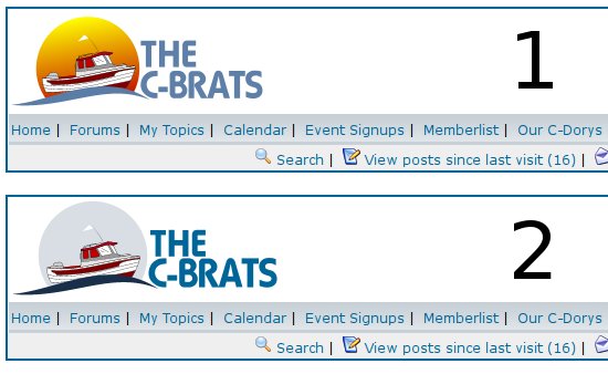
With the new ads coming in a couple weeks, we need to tweak the header area on the site. The ads will be in the upper right portion of the header, the logo to the left.

As such, the logo needed to have the site name included, so I've worked with a design guy to narrow things down to the following two mockups.

Now...TyBoo and I already have a favorite, so this isn't necessarily a "most votes wins" type of poll. However, if there's a significant leaning towards the "other one", we may just reconsider.

So...vote 'em up.


logopoll.jpg
 
Hmmmm... one that looks like a sunset behind the 16 or one that looks like... well, not a sunset. 8) Both are nice, one is more warm and inviting. But, that's from a sunny-kinda guy. :hot :D

Best wishes,
Jim
 
The reason I voted for #2 is that the C Dory stands out more to me.

In #1 my eye is drawn to the orange logo background first.
 
Both are nice. #1 looks like from So Cal or Southwest, but I believe the C-Dory design with enclosed cabin and all sets it apart by being able to survive colder and more inclimate weather with ease. I like #2 for that reason, looks more like cold weather (or the moon?).
 
Hmmm...the voting is close.

You know...nobody says we can't swap things out for the seasons. If Google can play with their logo, so can we.

Now...this isn't in the running for the site logo, given the colors. But, it shows how we'll be laying out the C-Brat text for goodies.

Come on, guys...can't you just imagine your gal in a black top, sporting this layout? Hubba hubba...
:mrgreen:

Grey-on-Black.png
 
All those logical reasons that have been mentioned aside, I like number one with the sun behind the boat because the colors are much more dramatic and the overall effect is much better. Put simply, it's a much better piece of ART!

Hooray for this:

Grey-on-Black.png


Joe. :teeth :thup
 
I am voting for # 2
Why, you ask?????
it looks more like the current logo and stays more traditional.
# 1 looks to comic for my taste.
I would prefer if there were no moon or sun behind it
 
I'll put on my textile hat and say, while I like the sunset, it is difficult (but not impossible) to embroider a sunset. If screen printing the design you would also be looking a greater expense. In short, if you want to closely match the sunset design on "logo wear" its more difficult and expensive.
 
# 1 looks to comic for my taste.
Hmmm, come to think of it, it does look a bit comical, that was in the back of my mind. Also, looks like red window coverings are still ON while in high seas --- . :shock:

Still, better artwork than I could do!
 
Interesting.

Roger...why are you up at 1am? Taters must be done and the equipment fixed...? Join me in Portland Maine at the boat builders show.

Well... I like Rogers thoughts on the tradition. What if we took the little boat out, and just put the traditional C-Brat words in the sun set like gizmo. Or, could we get a Rosborough put in there... :mrgreen: Sorry.. The devil made me do it. Been too nice lately and had to let a little out.

Please all take that as humor...and/or do not get your drawers all in a knot. Or, go ahead and get'm in a knot...it may be the only fun you have today.

Go get on your boat!

Thanks guys! Yall are doing a great job!

Byrdman
 
dotnmarty":3gg53nt4 said:
I like the burgee on the antenna.

Ain't that a nice touch? We even came up with a new burgee design, but it's a little hard to see on those little versions - here's a close-up.

I'm sure ccflyer will just tell us how much more difficult this makes the embroidery, but it's a trade-off we were willing to make. :mrgreen:

brock-flag.png
 
# 1 was my vote . next time give choice # 3 , a 21 EC it will probably win by a landslide!!!! :roll:
 
Back
Top