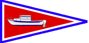
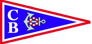
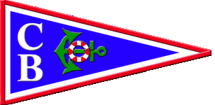
C-Dory Burgee Order!

drjohn71a":2jwzbbcb said:
Great, Tom.... That logo ought not to upset anyone!!!!
Sorry folks, I take back my earlier suggestion.

How about this one for the C-Thugs Burgee ?
rebelpirate.jpg

Cheers,
Tom
 
tom&shan":177ieiq7 said:
drjohn71a":177ieiq7 said:
Great, Tom.... That logo ought not to upset anyone!!!!
Sorry folks, I take back my earlier suggestion.

How about this one for the C-Thugs Burgee ?
rebelpirate.jpg

Cheers,
Tom
There is only one thing I can think of that would provoke more comment and I'm keepin' my big mouth shut.
 
I guess I will put my 2 cents in, for what its worth. I have always liked the C-Dogs logo - and still wear one on Swee Pea, not because of my affiliation, but because I like it.

I really do not care for the logo (boat) that the Brats use. I agree that it is too cartoonish. I am not complaining. I appreciate the effort that went into creating the logo and the hard work maintaining this site. Whatever the moderators want for this site is fine with me. It is the fine talk and great folks that make this site, not the logo. But I would not purchase a burgee with that boat on it.

I also understand that some of the Brats, for whatever their reasons, do not want to fly the C-Dog burgee. I respect that as well. I would be willing to fly the C-Dog burgee, only because I like the design.

If someone comes up with another design that I like, I will buy one of those. But I would personally want an image of a C-Dory, not C-Brats - at least for a burgee.

John
Swee Pea
 
Swee Pea":3b57gwib said:
I guess I will put my 2 cents in, for what its worth. I have always liked the C-Dogs logo - and still wear one on Swee Pea, not because of my affiliation, but because I like it.

I really do not care for the logo (boat) that the Brats use. I agree that it is too cartoonish. I am not complaining. I appreciate the effort that went into creating the logo and the hard work maintaining this site. Whatever the moderators want for this site is fine with me. It is the fine talk and great folks that make this site, not the logo. But I would not purchase a burgee with that boat on it.

I also understand that some of the Brats, for whatever their reasons, do not want to fly the C-Dog burgee. I respect that as well. I would be willing to fly the C-Dog burgee, only because I like the design.

If someone comes up with another design that I like, I will buy one of those. But I would personally want an image of a C-Dory, not C-Brats - at least for a burgee.

John
Swee Pea

Privately I agree with you, just don't tell anyone, OK?

PS: I think I passed you guys on the ICW on my way N. to Tampa (tan CD-22 radome) just N of the Gasparilla Bridge (or there's another "Sweet Pea" out there).
 
Dave,

Those are really great...........nice job.
Can we change the color scheme on the new burgee to match the color of the Brats with Green boats..........................JUST KIDDING!!!!!!!!!!!!!!!!!!! :beer :smiled I REPEAT..........JUST KIDDING!!!!!!!!!
 
C-Brats,

Here is the first C-Brat logo.

scan0025.sized.jpg


I own the rights to this logo and I will make it available to the C-Brats if anyone here wants to make it into a burgee. Black on white with a black border would go with any color scheme. The www could be removed.
 
Whew! I finish a day of packing up the ol' Mom-in-law, and there's 12,487 new posts, most of them on this thread! :crook About the only thing that could create more controversy would be... one motor or two on the new burgee?? :twisted:

Yes, I'm kidding. I'm a kidder. That's what I do. I still prefer the original burgee with the profile of the boat. If there were any bad feelings, it's time for a "Let It Go" day here in C-Doryland. :wink
 
Oldgrowth, just kidding about the color match (I do like the colorfulness of it) but here is a serious suggestion. Take Sneaks "C-B" from his "C-Brats" on page 5 of this thread and use it instead of your "C B" ; this would parallel C-Dory's style (are we excluding C-Rangers here? No, they are still C-Brats) and I like the larger "C" enveloping the "B" and its form follows the burgee form (tapering to the stern). Can't work the graphics or I would show you. For further simplification you could drop the anchor and life ring; this would be getting closer to a logo recognizable from a distance.

Jay
 
Actually as I look at it again, my final suggestion was to use Sneaks suggestion dropping the "rats" (we don't need any of them aboard). It gets away from a burgee to-be-read and closer to a burgee with a logo.
 
Back
Top