letter size boat name

We measured the C-dory logo on our boat and took a couple of pictures. Then we took that to our local sign maker. They matched the font from the pictures and used our measurements. We got three peel/stick and peel "C-squirts" and two sets of registration numbers in our trim color for less than $30.00 in heavy vinyl. Pictures in our album.
 
Boat Name letters....

Oh, Oh....You've just rung my bell. :twisted: My two big peeves are...Your countries flag flown incorrectly and boat names that cannot be read over 50' away. :sad I don't care what you want to call your boat, if I can read it. No fancy squiggles, or non-contrasting back grounds. 6" or greater block letters are great. :thup :wink Nothing personal...Must be my Flu shot making me act like a pig. :crook
 
Capn Jack":3qy704nr said:
Boat Name letters....

Oh, Oh....You've just rung my bell. :twisted: My two big peeves are...Your countries flag flown incorrectly and boat names that cannot be read over 50' away. :sad I don't care what you want to call your boat, if I can read it. No fancy squiggles, or non-contrasting back grounds. 6" or greater block letters are great. :thup

Amen, Brother!

/david
 
6" might be a bit big for the smaller C Dories, but 4" is minimum for Coast Guard documentation. That is the size I have gone with for the C Dories I have owned.

It is also nice to have boat names on the front, back and sides--so that the boat can be hailed on the vHF--of course now--you may have AIS...Which will give the boat name on the plotter.
 
Bob, :)

We always keep the I.F.F. Transponder on. In these times it keeps "Frendly Fire" to a minimum. :roll: You know how sinister a 16' C-Dory looks. :wink
 
Capn Jack":2h3szrfl said:
Boat Name letters....

Oh, Oh....You've just rung my bell. :twisted: My two big peeves are...Your countries flag flown incorrectly and boat names that cannot be read over 50' away. :sad I don't care what you want to call your boat, if I can read it. No fancy squiggles, or non-contrasting back grounds. 6" or greater block letters are great. :thup :wink Nothing personal...Must be my Flu shot making me act like a pig. :crook

I wish I could find my "attempting to give a damn.gif". That is honestly not meant to be personal or derogatory, but I just can't see how it matters.
 
Capn Jack":2dnfp02a said:
Boat Name letters....

Oh, Oh....You've just rung my bell. :twisted: My two big peeves are...Your countries flag flown incorrectly and boat names that cannot be read over 50' away. :sad I don't care what you want to call your boat, if I can read it. No fancy squiggles, or non-contrasting back grounds. 6" or greater block letters are great. :thup :wink Nothing personal...Must be my Flu shot making me act like a pig. :crook

I also like the names to be large enough to read easily, without some cutsie cursive style I can't read.
 
Maybe it comes from noting that often times a vessel cannot be hailed by name for lack of name position, size or having the name covered by a dingy or deck "stuff", but when we decided on a name for SleepyC :moon I had a few concerns:
1. As large as would fit in the space available.
2. As easy to read as possible, from as far away as possible.
3. Colored as close to the boat trim color as reasonable.
4. As easy an application as possible.

I put the name under the windows, on the sides and forward, lined up directly under the front post. The size was based on the flat space between the roll below the window frame mount and above the roll up from the deck. (Had to take into consideration the distance from the top of the capital, or upper case, to the lowest part of the descenders.) I believe the distance was 8" total. The font was chosen to have no sharp pointed corners. That decreases the chances of a corner getting rolled up by being rubbed somehow.

Knowing what I do now, I would consider putting the name forward of the nav lights, because I find that when I am walking the deck, I often catch my feet (shoes) rubbing on the lettering. So far no problem but I do try to be careful.

Here is a link to our name installation process:
http://www.c-brats.com/modules.php?set_ ... _album.php

Good luck, and enjoy.

Harvey
SleepyC :moon
 
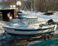
I'm not sure exactly what size this is, but it seems like a good size to me, even for such a small boat. It was as big as I thought I could put in that location and keep some while space over and under the lettering. Since I sold the Navicula I can't measure it. I'll try to find the invoice and see if it has the size on it.

Navicula_graphic.jpg[/img]
 
I just ordered new decals for the 16. Hope the cutsy cursif isn't too much. They will be in 5".

188134-9727s.gif
 
i grew up in a sign shop, my family has owned one for 28 years, i have now put graphics on a handful of c-brats, my dad put the label on some of the first c-dorys to hit the water. in the sign industry the top priority is readability, it doesn't matter what you say if no one can read it. make your graphics readable and you can't go wrong
 
100% agree with Kevin!

My art teacher buddy once gave me a few tips on the subject:

1. Simple is better (KISS again!)
2. As large as practical within aesthetic considerations.
3. Don't use all capital letters (looks blocky, hard to read).
4. Simple, readable font (cursive, fancy, elaborate fonts very hard to read).
5. Outlined, shadowed letters and double colors, interfere with readability. Select letter color for best contrast with background.
6. Simple names are better than long ones,both in graphic readability and verbal VHF communication.

Just think how few people can even make a Yard Sale sign readable! E.g.: Too much information, printing too small, all caps, poor color contrast, violation of every consideration possible. You get rear-ended while trying to low down to read it all !

Joe. :teeth :thup
 
Back
Top